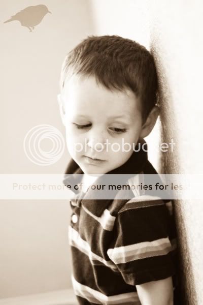
I do have a few little tips that IMO look nice and are things you might want to look out for.
FIRST: To Flash or not to Flash? Some people LOVE to use there little stock flash on there camera. I however can see a big difference when I use it. For Example.
The first two were taken in the same spot, with the same natural lighting. The first one was taken with the flash and the second was taken in manual. Can you see the difference? One is a bit washed out and the body sticks out dramatically from the background. In the second the colors are natural and the background has a beautiful blur.


Even when Edited you can see there is a big difference. I used the same preset for both of these pictures. The first being with my flash and the second in manual.


SO, How can you take pictures when it is dark outside? Either get a professional flash if your a flash lover OR figure out how to use your camera. There are tons of settings that will help brighten everything up. Learn about your ISO and all that Jazz! Its worth it. I have a friend who taught me and it has changed my photography experience! (Thank you Kayla)
SECOND: There are three basic edits I use. I took this photo (first one is unedited) and made it a color, Black and White and a Sepia.

COLOR

Black and White

Sepia (Here is a little Sepia hint. Its not yellow, its brown! IMO)

THIRD: Vignettes. These will make you or break you. They can either be so beautiful that its just what the picture needed or make the picture look dirty and take away from the picture. For example. This is a picture I thought had a lot of potential(first unedited) that I turned Sepia.

Now that it is Sepia I wanted to make it a bit more "edgy" so I darkened the corners just a little.
Good Vingetting!
Bad Vinetting!! Do you see how DARK the corners are, they go to his face and make it look dirty and unprofessionl (IMO)
FOURTH: "red face" do you ever see an adorable picture and just wish that person would use there white balance or fiddle with there red primary? Like this great picture. Edited before toning down the red. The second is playing with saturation and raising some orange primary and lowering the red. Works every time!
SO, this is alllll just my opinion. Thing I have learned from a few years of trial and error. My real advice. Find your niche. How do you edit pics? Do you like it bright or grungy? What do you like? You have to find out. Do tho, look at other photographers and ask for opinions. Make sure it is pleasing to others. If it isn't your probably going to be the only one enjoying your photography!
SO, give me your photography advice. What are things you have learned from Trial and Error and if you are having a hard time and want to ask questions ask away. There are a lot of photographers that have some serious skill that will be able to answer you!
Bless you all!!


5 comments:
I need to get a real camera. I just turn the dial until the light turns green and start yelling to everyone, "hey I am trying to get some photos!"
Can you tell I'm behind? You've done some great work the past couple of days - I'll have to pick up your challenge again next week (I hope). I think there will be many people who will appreciate you breaking down your style. I think the biggest thing most people need to know is to shoot manual - there's a huge difference in the quality. Great work.
I agree. People need to learn how to use the camera. Dont settle for the flash!
IMO, you're awesome. I totally agree with everything you say! and thanks for the shout out. I'm glad someone has learned from my endless chattering! Flash sucks, Manual (not Manuel...I spelled it wrong the first 6 times) ROCKS! Keep your temperature as natural as possible...that's why they created a white balance built into a camera and DONT OVER PROCESS...the more you process the dingier (that's den-gee-er) your photos get! I think you hit all the main points!
I'm still learning! Thanks for the great tips!!
Post a Comment